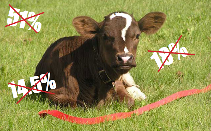
Like me, you might be accustomed to seeing percentage figures on posters and elsewhere, indicating livestock’s share of greenhouse gas emissions. I’m not keen on quoting figures indicating livestock’s climate change impacts, unless I can try to explain them. Posters are not a great way to do that. One problem is that, while environmental processes are dynamic, the figures are often portrayed as if they’re set in stone. Another problem is that the figures depend on whichever factors have been taken into account, which can vary significantly from one report to another.

Animal Agriculture’s Impact on Climate – Do Percentages Matter?
© 2009-2025 - A Well-Fed World - EIN: 27-0865905

